
Lovely as it is in a scan, when you hold the paper product in your hand, it raises questions. Most obviously, why are the registration holes not cut through, but are simply copied on top of the page? The paper too feels thinner, “slicker” than the studio production paper many of us collect. Most ominously, the images of the falling water, though drawn with a very sharp pencil, leave no indentations on the front or back of the paper.
Bottom line: ArtLand, and presumably other major studios, have invested in some high-end color copiers and are using them intensively as part of the animation process. While some of us won’t find that a problem -- settei and storyboards, for example, are normally available only in copy form -- others of us might be troubled by obtaining something that looks like an original artwork but turns out to be in whole or part an extremely good color copy. It’s clearly going to be an issue for people interested in Mushishi art, and, unless I miss my guess, it’s soon going to be an issue for art being released from many other series.
Following is a first draft of a piece that will eventually go up in my gallery (presently delisted for installations) as part of my new “Mushishi Art Boards” corridor. I’d appreciate any corrections or suggestions you might have.
So -- for those for whom authenticity is an issue -- without further ado:
Mushishi Production Art: Is It Real or Ricoh?
Photocopying layouts for use in generating watercolor production backgrounds has been a common practice, as those who have collected cels with original BGs. Often these are marked up and sometimes elaborated by the Art Director or an assistant as a guide to the artist. Evidently the same practice continues even though backgrounds, increasingly, are computer generated in nature. And, with the increasing use of color copiers, it is sometimes initially difficult to distinguish an original drawing from a high-end copy.
To add to the confusion, the background team at ArtLand Animation Studio regularly used color copies as a base for drawings that substantially revised or elaborated the original layout. Hence a set of sketches may include totally autograph drawings, totally color copied images, and a number of sheets that include a mix of photocopied and original hand-drawn art. At first glance, the three are extremely difficult to tell apart, so here are some basic guidelines, based on my close study of a range of Mushishi art.
Signs of Photocopy Art:
1. Look at the registration holes. If they are cut through, the art is probably autograph. If they are simply copied on top of an uncut page, the sheet is in whole or part a photocopy.
2. Hold the sheet at a sharp angle to a light source, until the light reflects off the black around the registration holes. If they are photocopied, they will shine brightly and evenly across the whole square. The “ArtLand” logo will shine in the same way. If you look at the rest of the image while rocking the sheet back and forth, you’ll see other parts of the image shine in the same way. These too are probably photocopied. The copy machine uses heat and high pressure to fuse the toner to the sheet, producing a flat, light-reflecting surface. A photocopy that is heavily colored will shine across the whole surface, while one with a lot of white space may shine only on the most distinct outlines.
3. Turn the sheet over and look at it under the same light at a sharp angle. Sheets bearing original art will show the mark of the artist’s pencil or pen on the back; photocopied sheets will be nearly flat and without impression.
4. Look at the sheet under a 8x or 10x photographer’s loupe. One of those inexpensive molded plastic ones is fine; you don’t need one of those fancy three-lens loupes made for jewelers. Photocopied images will resolve under this magnification into a fine collection of little dots, which are the actual bits of toner used to make the image. I like to call this effect “sand,” which is what it looks like on the sheet.
Alternatively, scan the sheet at 600 dpi. (300 dpi isn’t strong enough) and then look at the scan on the screen at 100% image size. If your scanner is a good one, you’ll be able to see the “sand” making up the image.
Signs of Original Art:
1. In the set I got, all four examples of ArtLand sheets that had cut-through registration holes (not solid white copies), the artwork was entirely original. All four also had been attached to other sheets with yucky Japanese celotape (all the photocopies that came with others were stapled). I don’t know if this is coincidence, though.
2. Original art leaves visible “hills” on the back of the sheet that can be seen when it’s held against sharply raking light. In addition, some of the black ink used was absorbent enough that it bled through to the other side. For a good example of this (actually the reverse side of the image at the start of this essay), see
http://img.photobucket.com/albums/v737/ ... hi26-4.jpg
3. Original art may shine in some places, but not as consistently or as brightly as photocopied patches.
4. When the sheet is inspected under a loupe, especially under raking light, you can see the texture of the paper’s surface. It’s not perfectly flat, but tends to make low hills and valleys. Pencil strokes tend to “catch” the hills and “miss” the valleys, producing an effect that reminds me of “skin” rather than “sand.” This “skin” texture is also visible in a 600 dpi scan, though if you use the loupe you can also see the topography of the paper’s surface as well. Black ink, by contrast, bleeds into the paper more evenly than photocopy toner, coating hills and valleys and leaving a smooth, crisp contour.
Color copy images, because of the pressure used to fuse them to the paper, cover the hills and valleys with “sand” without any variation and, even at their darkest, resolve as collections of dots with granular borders rather than as smooth lines.
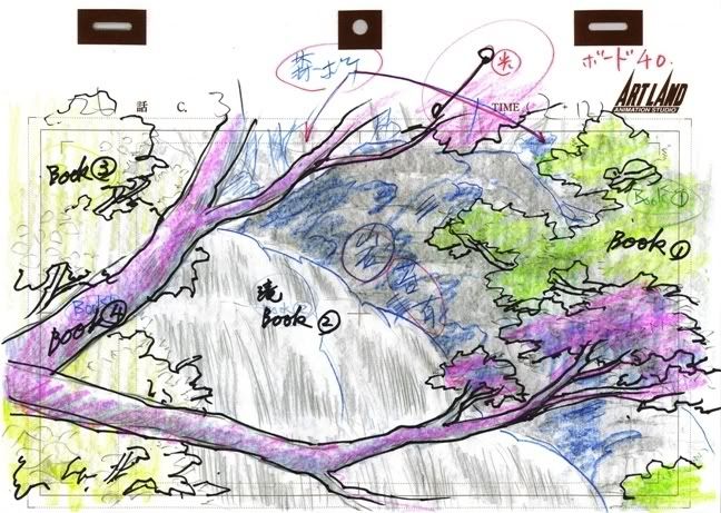
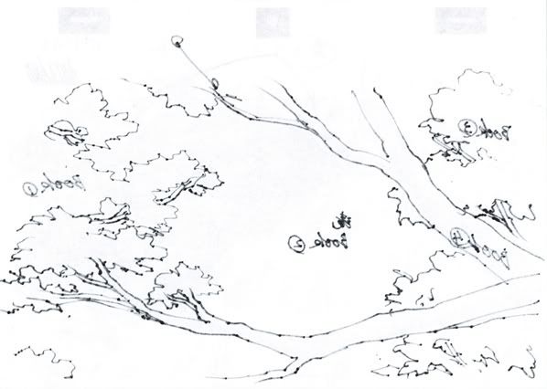
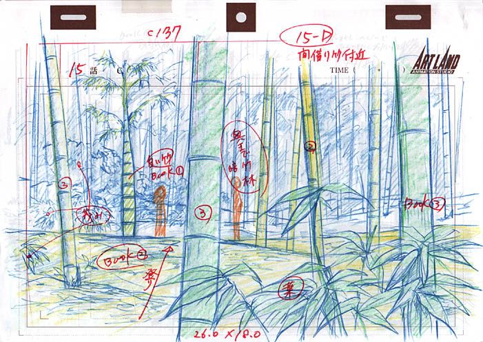
Here’s a good example of an art board that uses a color copy as a base, but then drastically revises and elaborates the background design:
When seen under a loupe, it’s clear that the images of the characters are photocopied, as are the general outlines of the rocks and trees. It’s also clear that the heavy black ink used in the foreground and the blue pencil used behind the characters is original art. If you visit these two images (selections from a 600 dpi scan I did of this piece) you’ll be able to see examples of both “sand” ( = photocopy) and “skin” ( = original pencilwork).
http://img.photobucket.com/albums/v737/ ... hi26-1.jpg
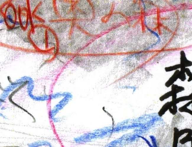
1. From the upper left of the image above. Black ink and orange pencil have been added by a studio artist to outline and revise a “sandy” photocopied tree limb, while “skin-textured” blue pencil is visible above and below. You can also see part of an original annotation in black and red ink.
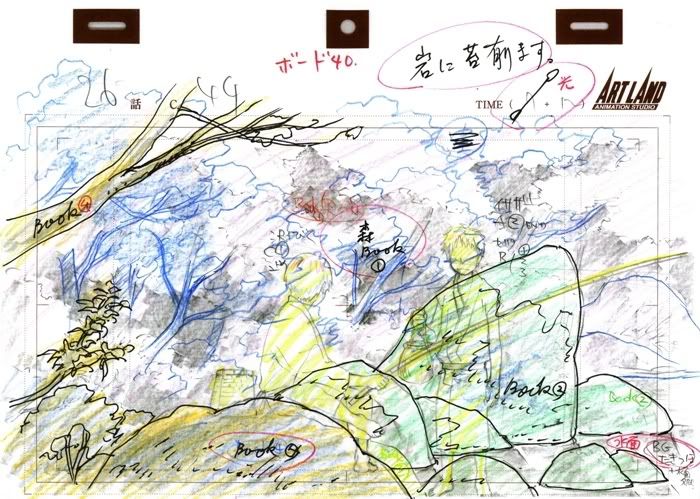
http://img.photobucket.com/albums/v737/ ... ishi26.jpg
2. From about the middle of the image above. A “sandy” photocopied section (including the lettering in red) is at the top, while “skin-like” blue penciling and a crisp original ink annotation are visible below. Note that the red circle around the ink annotation also “hits” and “misses” the paper texture, so it too must be original.
A comparison of this artboard to the actual broadcast image:
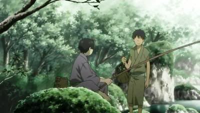
... shows that the revisions shown in this art board were in fact carried out by the ArtLand CGI background team, proving it to be an original, authentic piece of production art, despite its hybrid media.
The same, alas, can’t be said of all the pieces I got, though most of them do contain annotations and mark-ups from the production process. I’d guess that this is an issue that collectors will need to face, batch by batch, sheet by sheet, in the future. I’d strongly advise people collecting Mushishi art to invest in a good loupe and use it on every possible occasion; and unless I miss my guess people collecting other series should be doing the same.


